
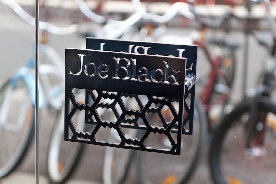
Joe Black/Marseilles
Joe Black is the freedom of shapes, the elegance of compositions, the refinement of assemblies, materials and chromatic balance. It is also the mention or citation, sensitive and respectful and yet always distant; sometimes amused, sometimes ironic of all that universally structured and determined the trend of men's ready-to-wear for the past four decades.
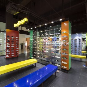
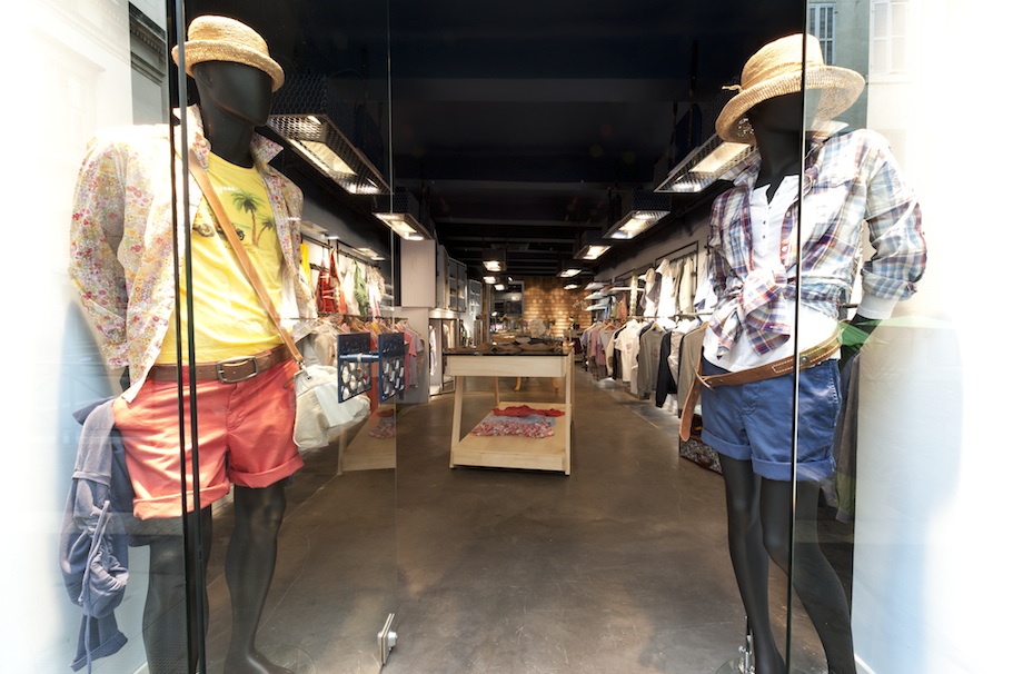
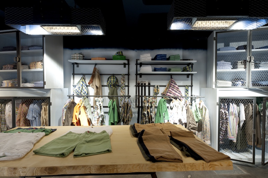
It is nevertheless what struck me as obvious from my first encounter with the collection. And that is what led me to define the identity-store for the brand Joe Black. Accordingly, there isn't one recurrent single pattern, declined and unwound from the shop front to the fitting-room through the storage shelves or the tables for unfolding the clothes.
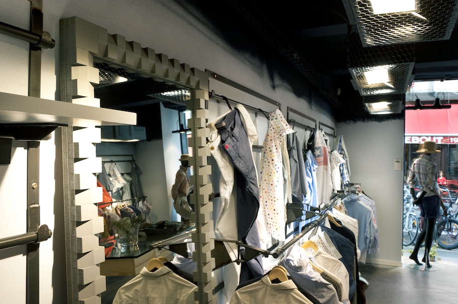
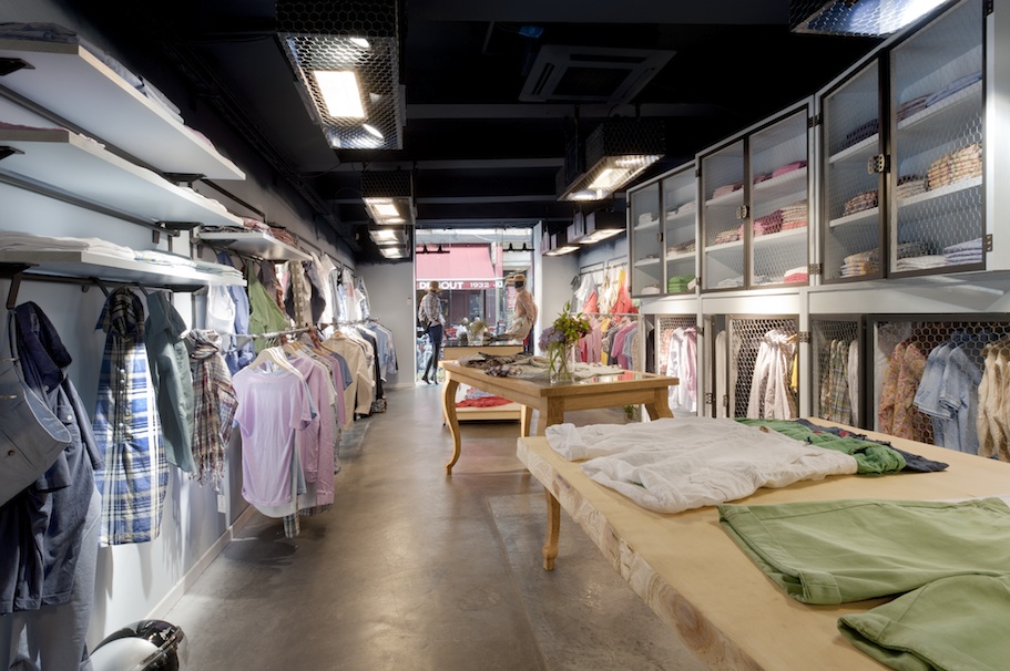
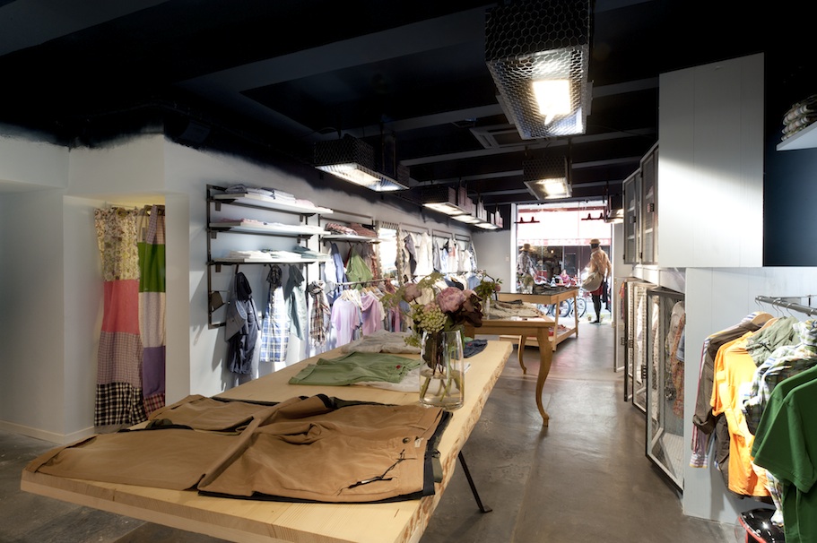
All the elements of the current merchandising are naturally present, consistent and effective, but the overall cohesion comes from the assumed and thoughtful eclecticism that drove the creation. This eclecticism is reflected in the use of a wide variety of materials which without affectedness or sophistication but with the greatest care are used at the will of uncompromising functional requirements such as unbridled narrative fantasies.
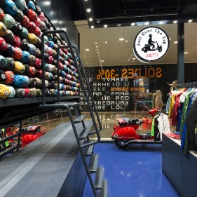
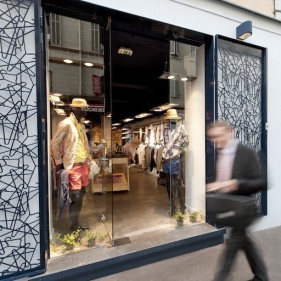
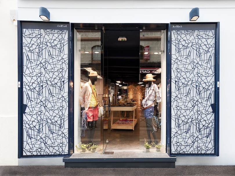
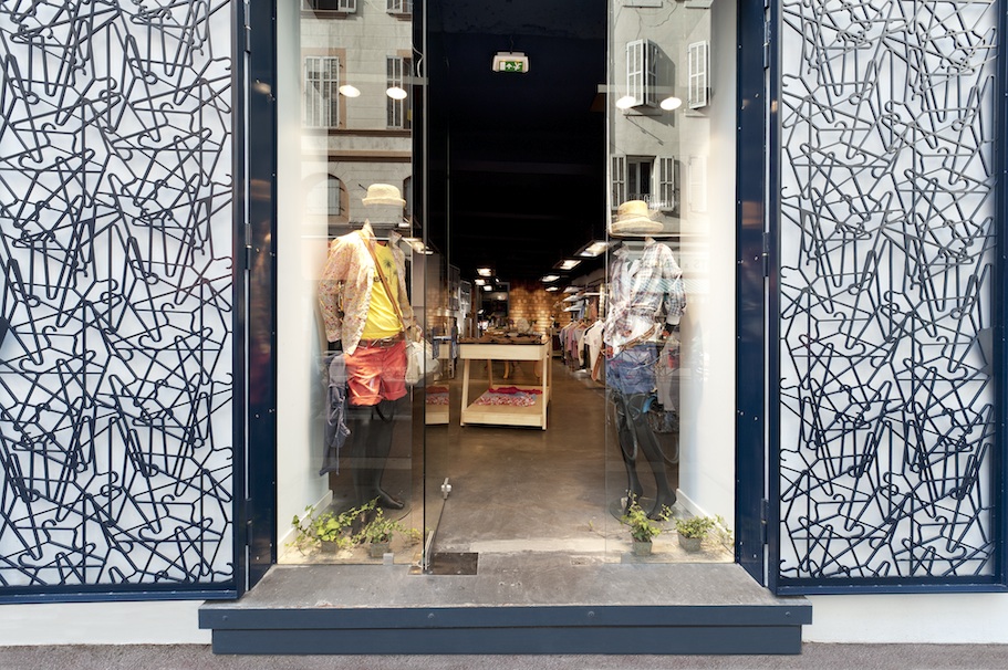
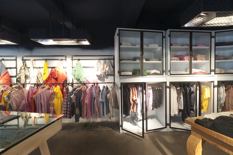
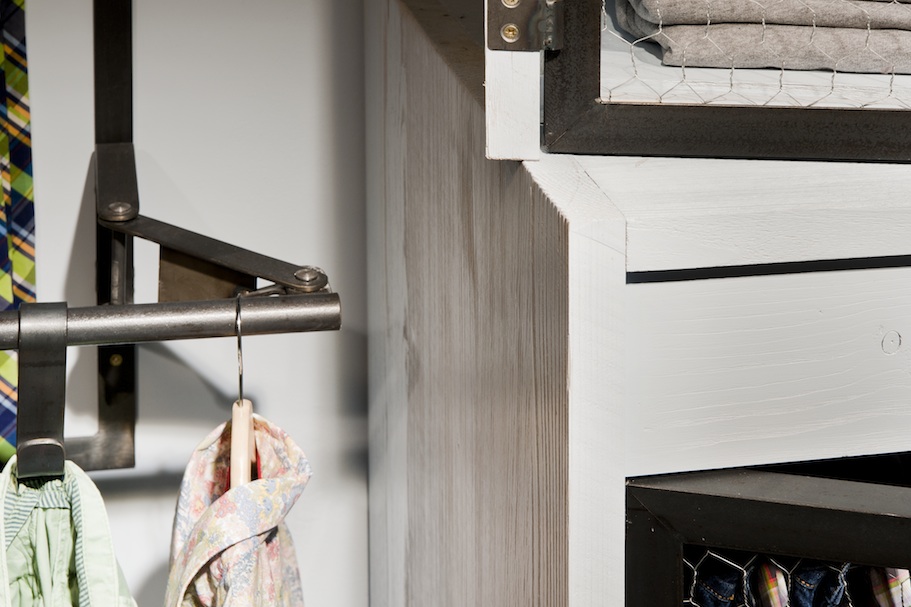
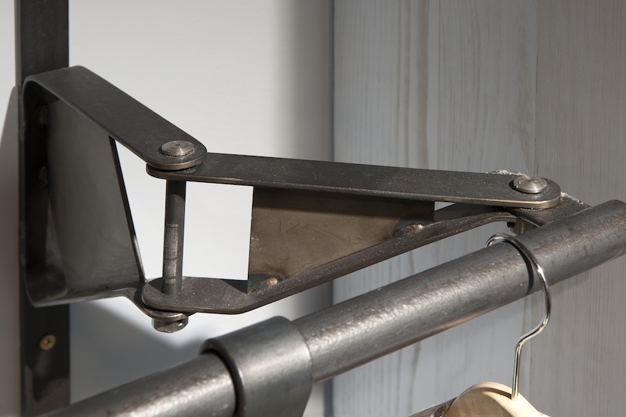
The traditional craft skills that give a particular attention to the manual intervention and to the most complex machining from the latest digital technology are here invited in a lively dance of stubborn and uninhibited know-how. So, if the randomly interspersed hanger patterns of the front's laser cut grids may evoke the joyful confusion of overstrung-style offices they nonetheless constitute a major element in identity and function and they fully participate in the site's protection.
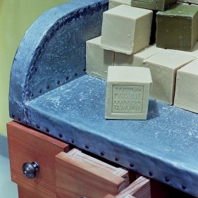
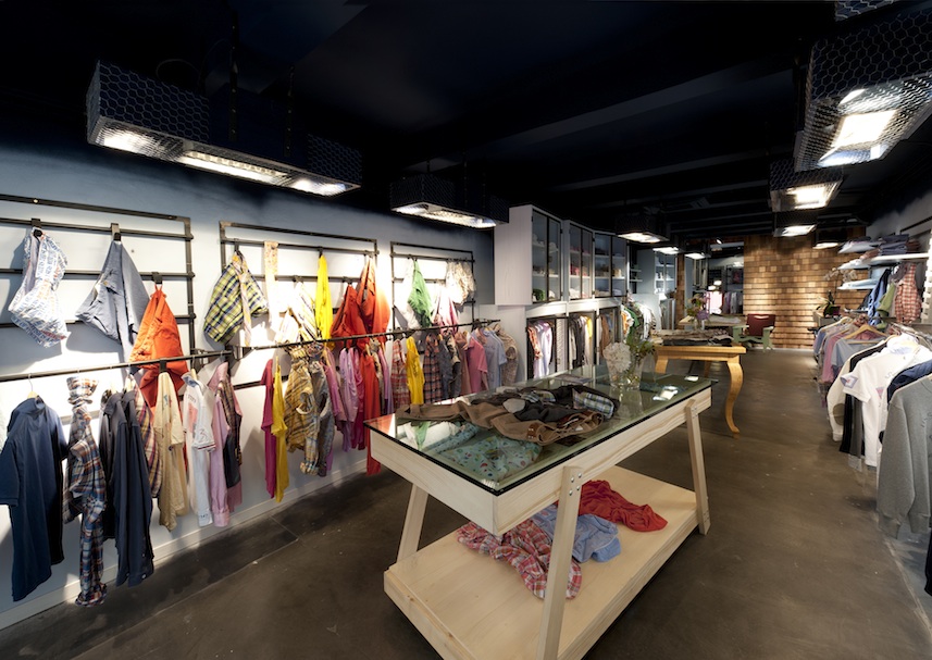
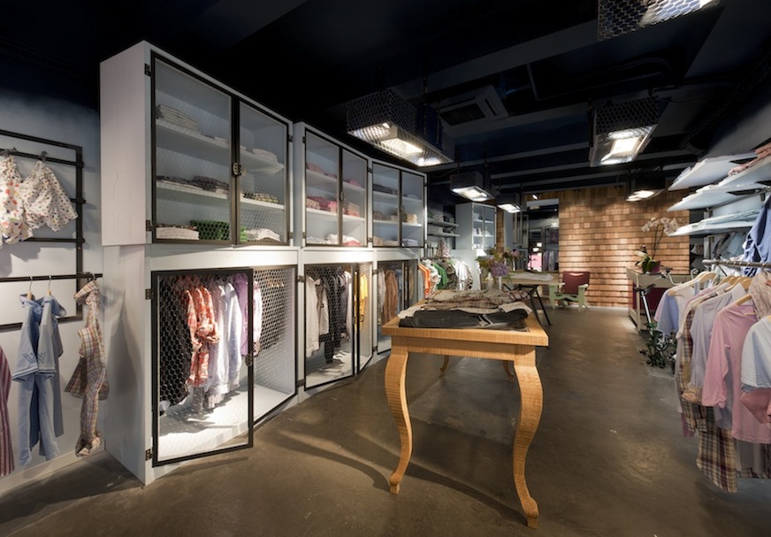
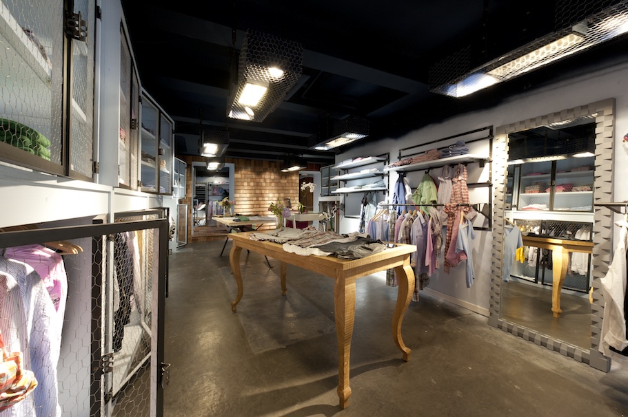
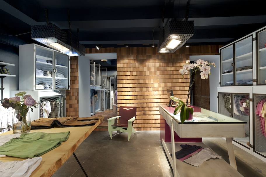
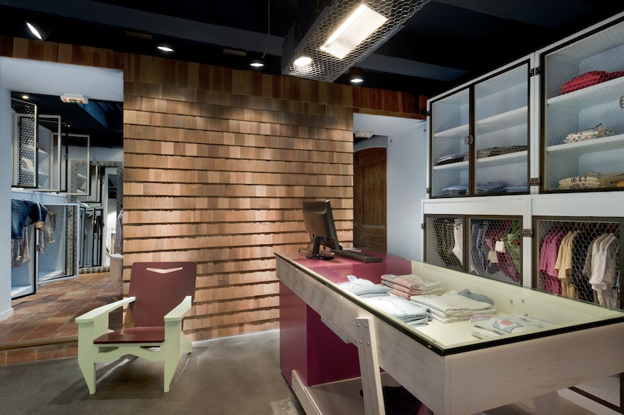
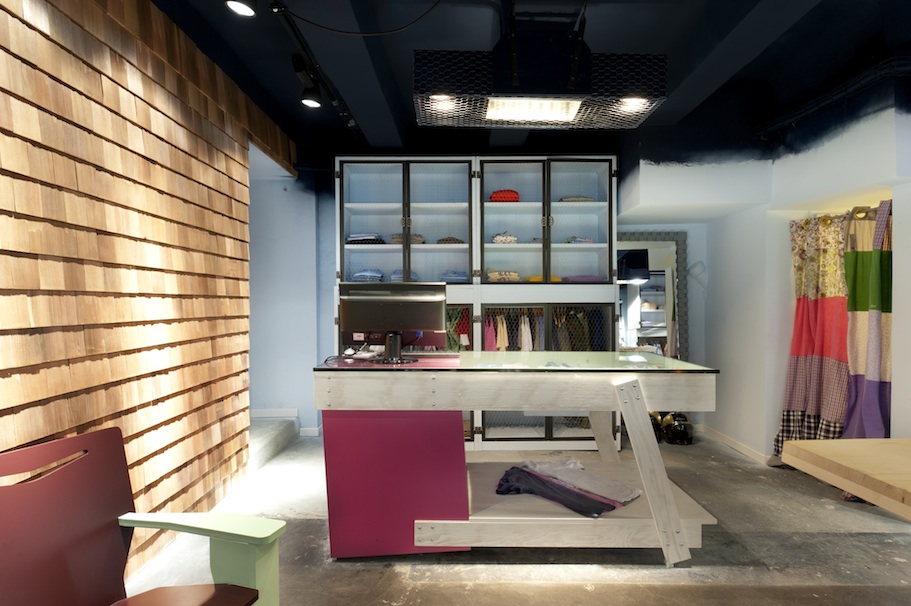
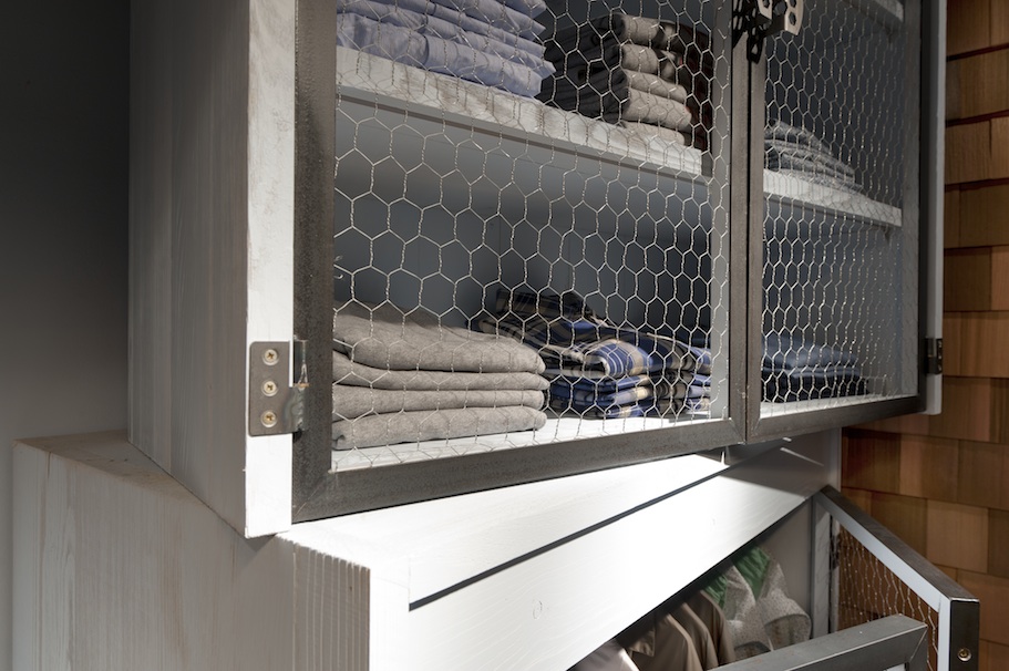
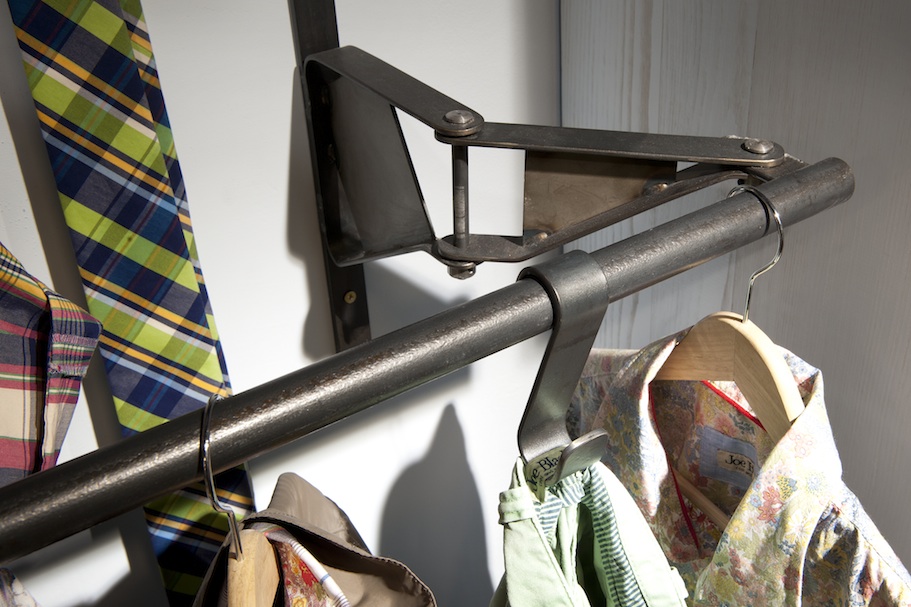
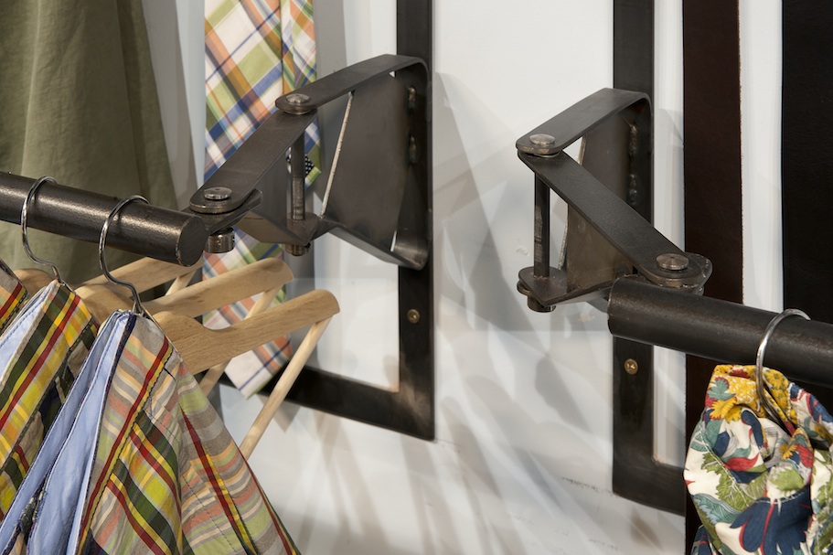
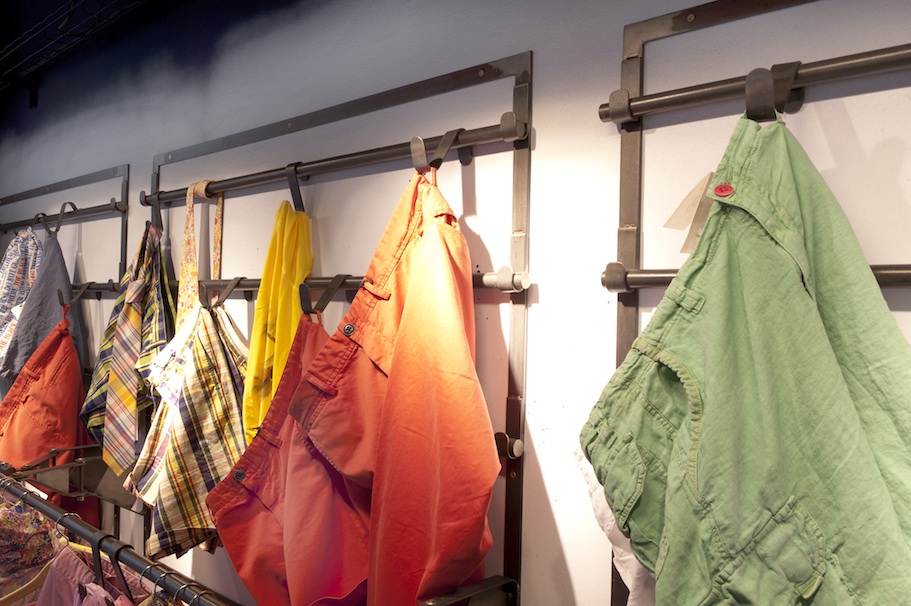
The exposed clothes are hung or placed on mobile and modular, plain-varnished raw metal systems that bear rods or hooks as well as hangers or shelves. The stockpile is also in the store, standing out as the retail space shall not be wasted in an abandoned back-office. It is stored in wooden cabinets, simply protected with hen-house wire used here for its most noble features : lightness and transparency.
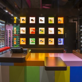
The disposal tables are all different and they make use of varied techniques and materials. The cash counter follows the same principle.
I also wanted to give to this world a personality and a sensual scent, without the use of perfume sprayed or diffused but with an architectural element. Thus, in the middle of the commercial space there is a wall covered with raw cedar shingles without any arrangement or wood stain or varnish that encourages a careful, caress-respectful, inhaling-allowed contemplation.
The main colour code, even if not dogmatic, gives a particular attention to blue; be it a night blue for the air elements or an identity blue or a sky blue for the walls and cabinets; always near the brand's Mediterranean origins but also respectfully distant from its most common and overused expressions.
Sorry, this entry is only available in FR .