Hylton / Plan-de-Campagne
Architectural “style” and “trend”, in terms of expression, never were a preoccupation when working on conception for HYLTON shops. One could argue about a “modern” attitude owing to the acknowledged lack of ornaments, but it’s a generic stance, a pretence. More specifically here, the objective was to keep from multiplying “symbols”, to produce as small as possible an amount of cultural or social reference. To make sense and only sense, addressing sense without the determiner in a foolish attempt to ignore its number, if not its type.
The device answering for its intentions: a shopfront is the first medium for the brand in its commercial appearance, the first window towards the customers. Its made is mainly invariable:
*a name (who now?)
*a partition, more or less transparent, itself more or less arranged: the limit (inside-outside, general-distinctive, me and the others, etc)
This is an attempt to upset that limit, to attenuate the characteristics of the obstacle without, of course, deleting it. There is no better and more direct commercial proposition than the stall-holder's, who offers his product with no protection or shelter but a horizontal tarp, without any frontal, vertical impediment...
The device:
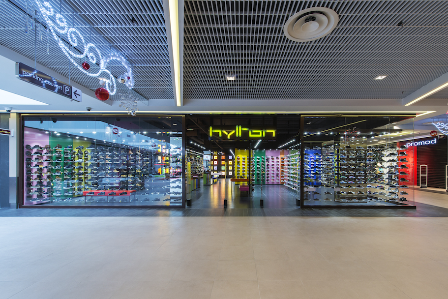
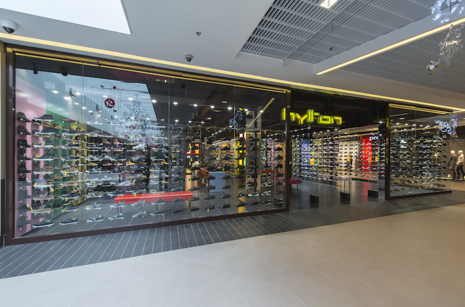
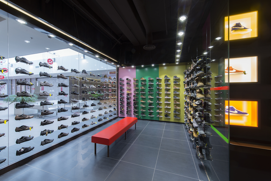
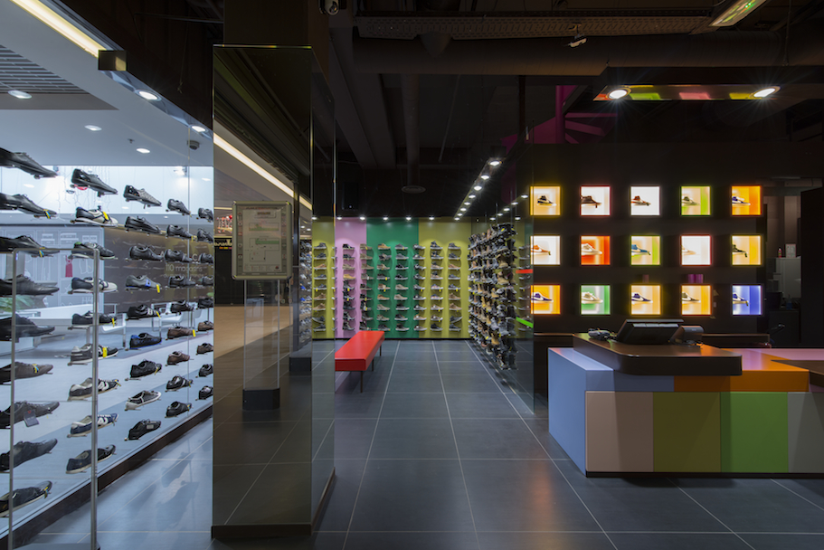
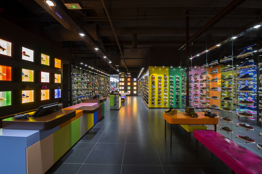
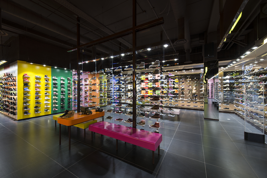
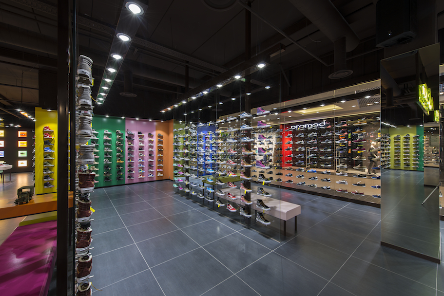
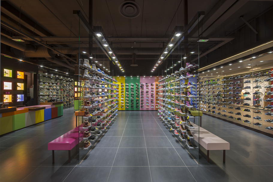
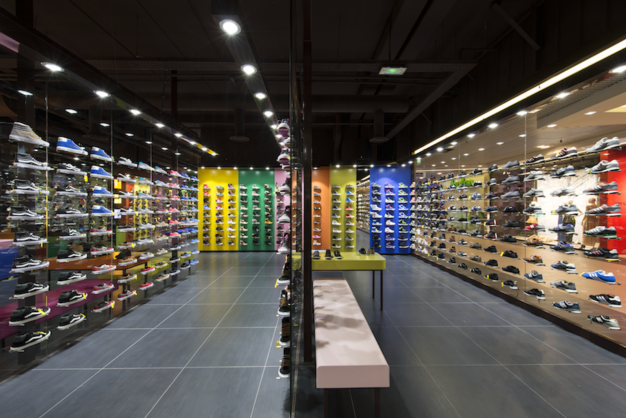
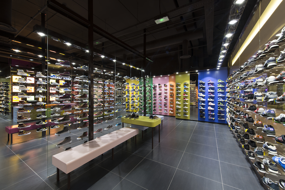
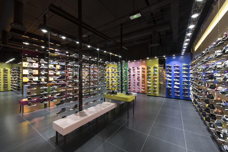
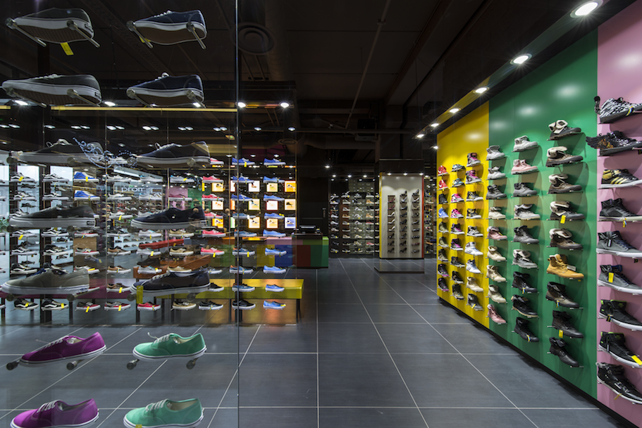
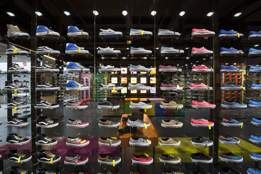
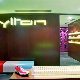
Stainless steel connectors are sticked to glass panes, themselves taking up most of the available surface for the ensemble, in accordance with a settled framework reaching up to the limits of standard accessibility. The connectors’ diameter is strictly necessary to their function and use: to receive a threaded spindle of the same material in a central threaded bore, spindles which are strictly dimensioned for the same functional objectives, here to hold and show shoes.
The benefits of this device are many and it isn’t simple (useful even?) to classify them:
* To prove to the closest, to show without lying, without telling a story, without a stage beside the product, etc...
* To show without creating a hierarchy on the offer by overwhelming the onlooker’s glance: we know that people’s look “generally” concentrates, at its best, on what’s presented between thirty and sixty inches above ground.
* Usual merchandising often overloads this strip and ignores the ones which are statistically left over. To the contrary, here, one’s glance is forced to embrace the whole and to run over the partition from top to bottom and from right to left.
* To show in the same way from the inside and out.
* To exhibit the onlooker, the one inside and the one outside therefore giving them an active status within the commercial space, in its attractiveness.
* To free an amount of space generally allotted to exhibition and return it to movement.
* To free management staff from the obligation to form employees to liven up the fronts, but also to convince all personnel, whatever their individual aptitudes may be, that they can contribute to creating the exhibition precisely because there is no possibility of a “mistake”. The shoes are all pointing the same way, but would one of them point the other direction the “incident” would be neutral.
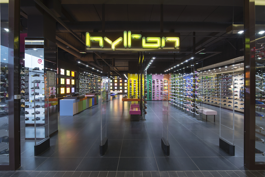
The shop sign is in the middle ground above the entrance, a way to avoid disturbing the onlooker’s reading with purely “referential” informations which are in the end disconnected from the product in itself.
The device’s shape varies on the inside partitions:
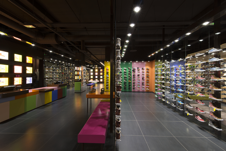
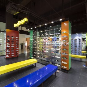
* On the partitions that double the boundaries of the premises, stainless rods are fixed on opaque coloured panels. The colours are chosen individually and coupled with regard towards complementarity (chromatically speaking) only, as relative as that may be. The pattern is invariable.
* Some of the inside partitions that have a boundary with the reserve are also made of the same glass panel device in order to:
To give a view (and only a view) over the “private” part of the business, relative to the reserve stock, to tell that the promise made on the front will be held.
To give back some space which is private (therefore “unproductive”) to the marketing space.
To appreciably engage all personnel in an impeccable upkeep of the exposed stock.
A merchandising principle which adds the stock to the direct offer but also keeps the shopkeeper’s authority filter and compels a part of the personnel to move about the reserve to fetch a shoe size. A device which avoids the de-personalisation of service as can be observed in shops where shoes are exhibited on top of a pile of boxes which the client browses without assistance the product which suits them (or not). And more generally, when the stock is on the shelves (supermarket sector).
To imagine light as an “egalitarian” device:
Only the product is lit, very intensely, as such as every shoe is literally “under highlights”, each receiving the same amount. From top to bottom, the loss in output isn’t significant given the light bulbs’ nature, their density, their proximity and the light ray’s verticality.
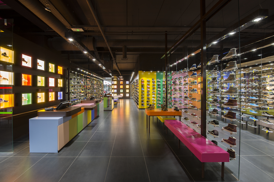
To stress the proposition the floors, the ceiling and the partitions above the glass panes and coloured panels are, almost in the dark, a light-eating deep brown. There are no “ambient” lights as the purpose is still to “dramatise” a “spectacular” offer. A dramatisation through light only, close to a museographical exhibition, without the mediation of a scenery or with a single one, minimalistic and unchanging.
The cash desk:
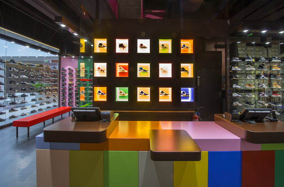
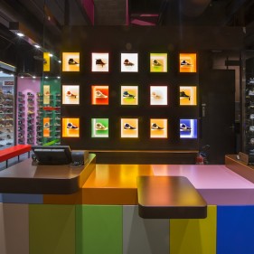
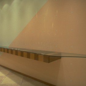
Drawing a cash desk with accessibility for persons with a reduced mobility that is both rigorously standardised and undiscriminating has been a puzzle for many years. The piece is an essential tool for the personnel who work standing, with a height of reference that is superior to the regulatory height for accessibility.
The idea came to reverse the point of view: the “accessible” level becomes the reference. The cash-holding machines are then added on as additional elements that the personnel can handle while standing.
The coloured alveoli which appeared in the 2013’s concept for Hylton are but an extreme manner of exhibiting some of the items in cases with corresponding hues and shades but similar shape and size.
It’s also a way for clients to keep in touch with the product when checking out . When paying the show continues, and the encased star is the same as the boxed one we leave with.
In 2013 as well, glass panes are added in the heart of retail space and this installation meddles with the reading of the consecutive vertical planes without disrupting the personnel’s control (as the opaque obstacle isn’t in their line of sight). This “meddling” is part of the show as well.
The functional necessity is the only rule applied for dimensioning:
For the cash desk, we covered that, the heights are adequate both in use and with regulations. This piece’s coloured panes, facing the public, tally with doors that give

